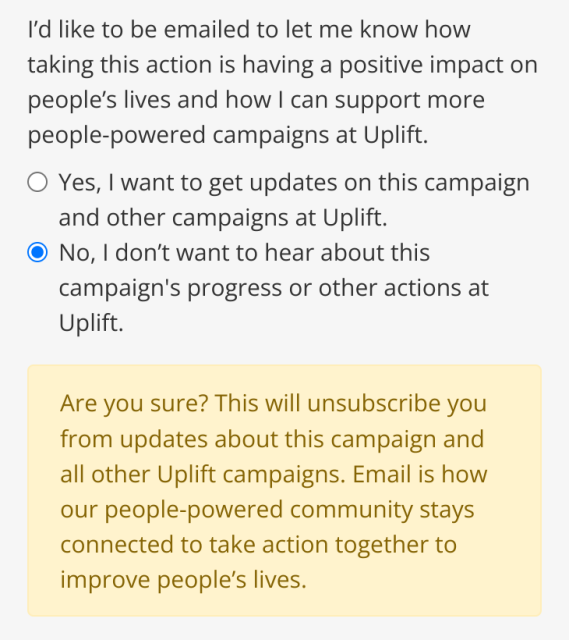
Folks, this is a deceptive design pattern. There is a very clear third option here (keep me updated on this campaign’s progress only) that is not implemented for marketing reasons.
I expect better from a platform that exists to effect ‘progressive change across Ireland’.
This entry was edited (2 weeks ago)


Brian R. Pauw
in reply to Aral Balkan • • •Stephen Farrugia
in reply to Aral Balkan • • •the cycle of virtuous design
https://hci.social/@fasterandworse/111391462452696684
Stephen Farrugia (@fasterandworse@hci.social)
🌱 hci.socialFemme Malheureuse
in reply to Aral Balkan • • •Professor_Stevens
in reply to Aral Balkan • • •The Fallacy of the Middle, made into a marketing strategy.
My policy for several years now has been to select the closest match to, "Never contact me in any way ever again for any reason." Somehow, the information I really need to have finds its way to me anyway.
Bruno Girin
in reply to Aral Balkan • • •Aral Balkan
in reply to Bruno Girin • • •Benjamin Balder Bach
in reply to Aral Balkan • • •